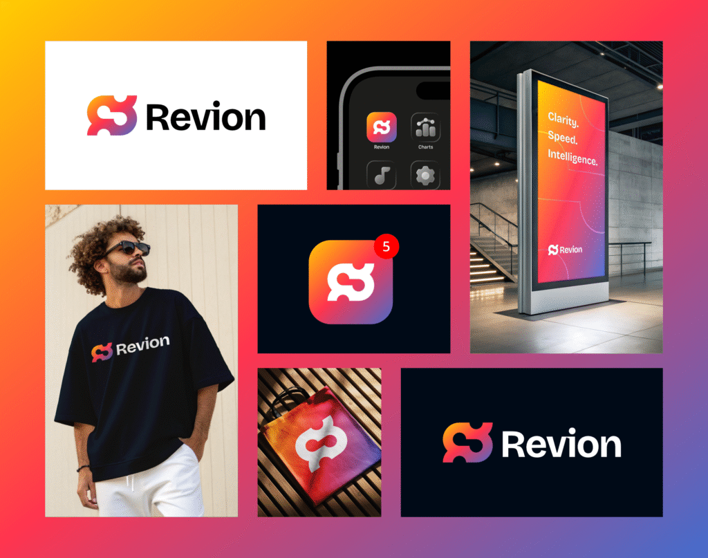
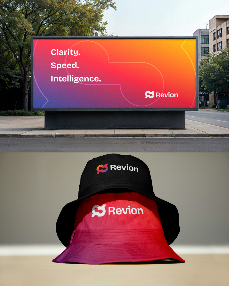
Revion started as an idea from a client who wanted to create something fresh in the AI space. They didn’t want the usual tech look. They wanted something with color, life, and energy.
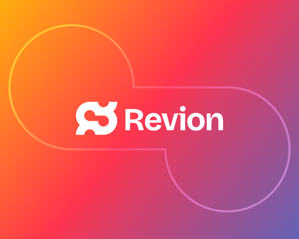
I began sketching around the idea of connection and movement, how people, data, and creativity flow together. That’s where the logo started to form, smooth and fluid, with a sense of motion.
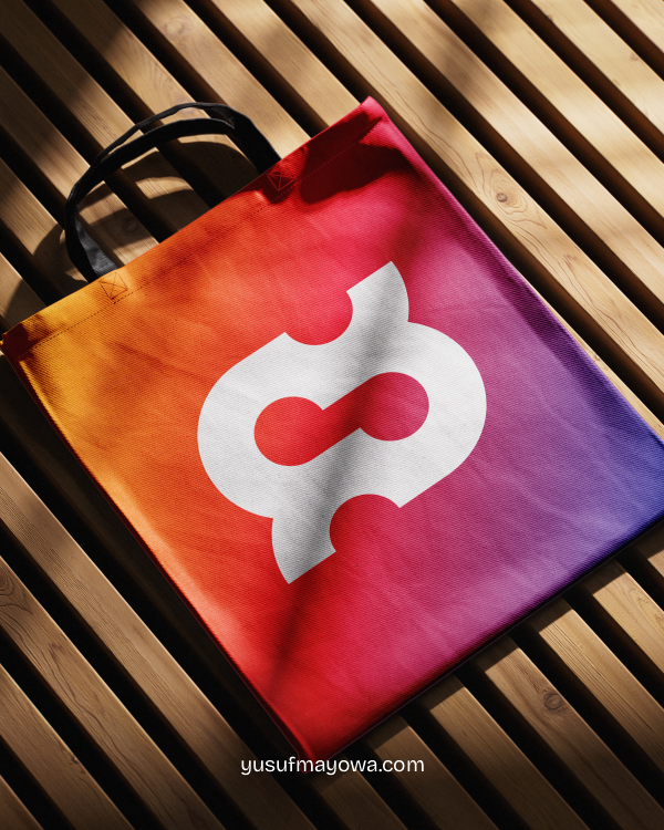
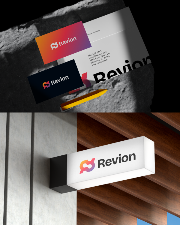
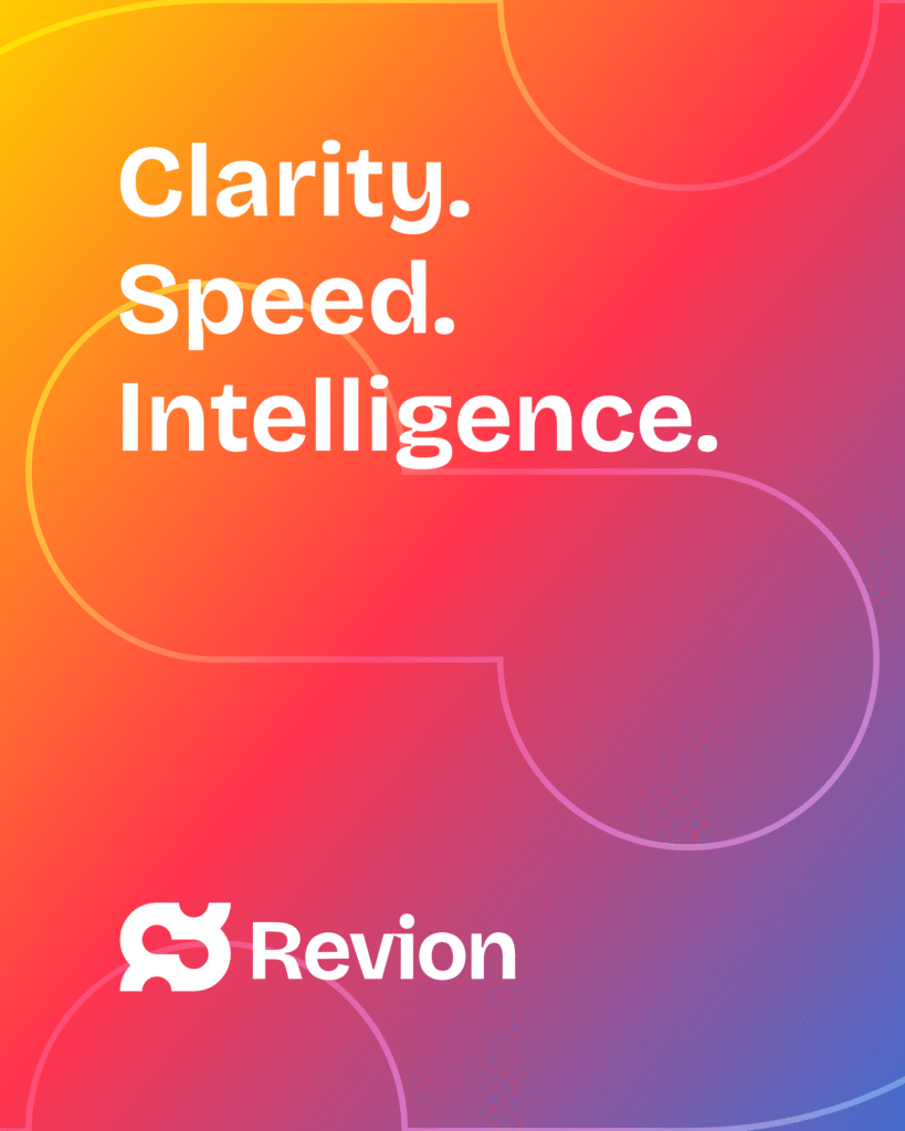
Once the mark was ready, I explored bright gradients that made it feel alive. The colors tell a story of growth and evolution, moving from warm to cool tones.
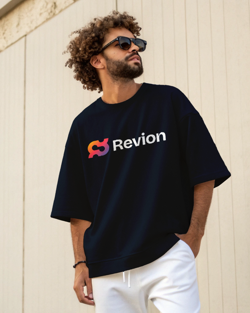
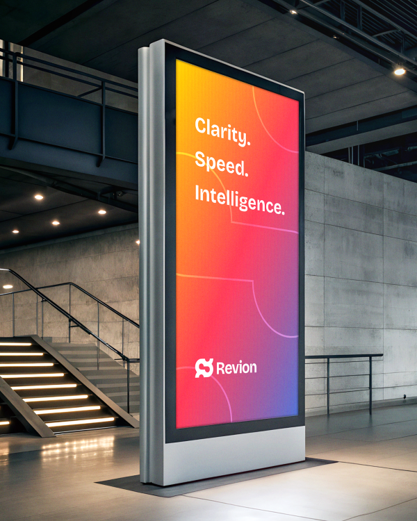
The final brand feels modern, confident, and full of personality. Clean typography, strong color, and a visual identity built to stand out.